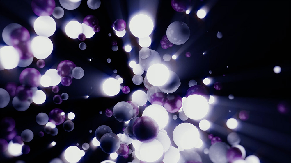
Logo continuity for IDEP, a school of design.
The programs used were Cinema 4D and After Effects. Based on the concepts of community and dynamism, the result revolves around movement, both of particles and the camera.
—— View project
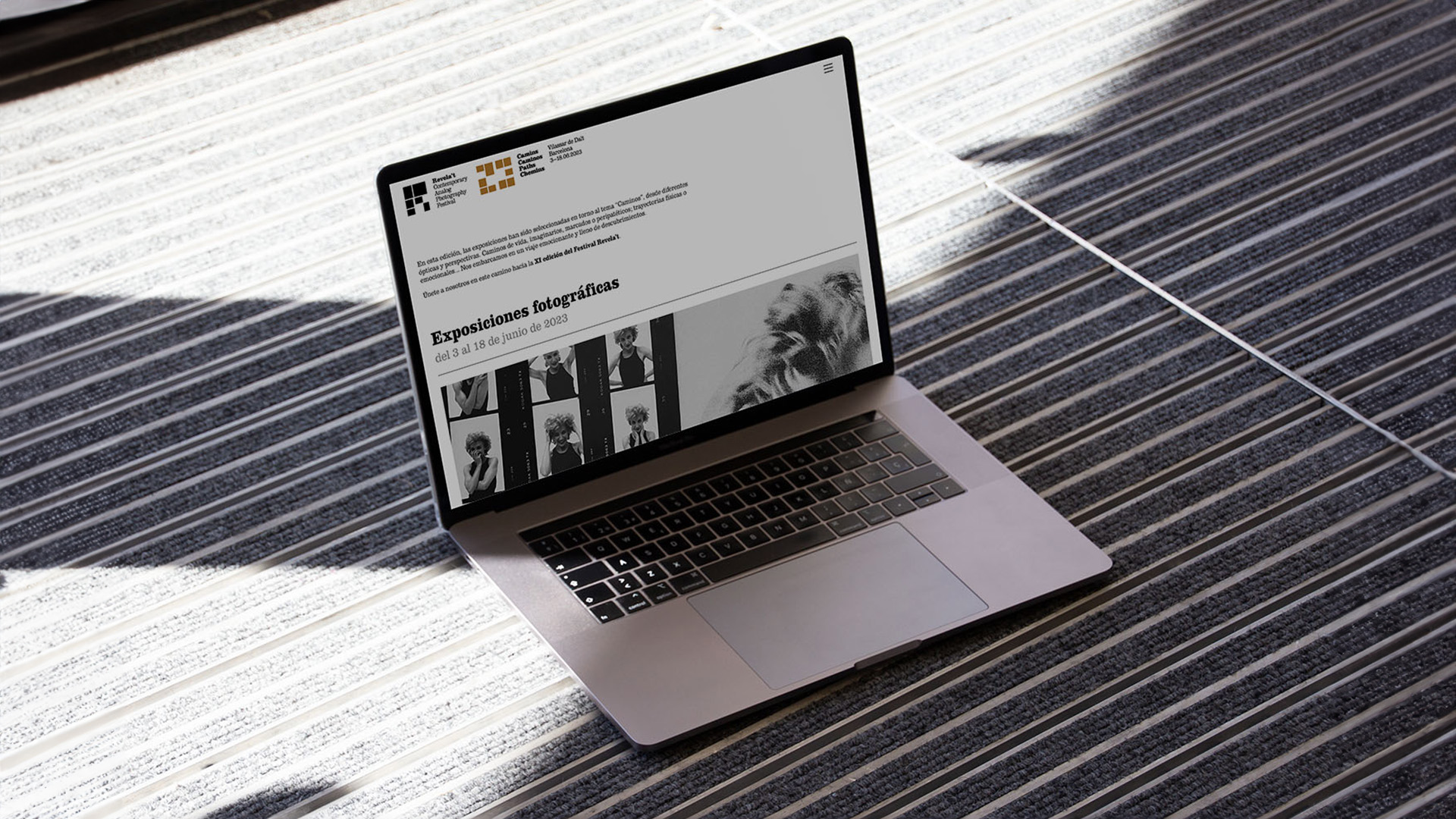
Web programming and design for the analog photography festival Revela't.
I used Wordpress and Divi to build the page, as well as some frontend code for the responding menu, footer, galleries, etc.
—— View project
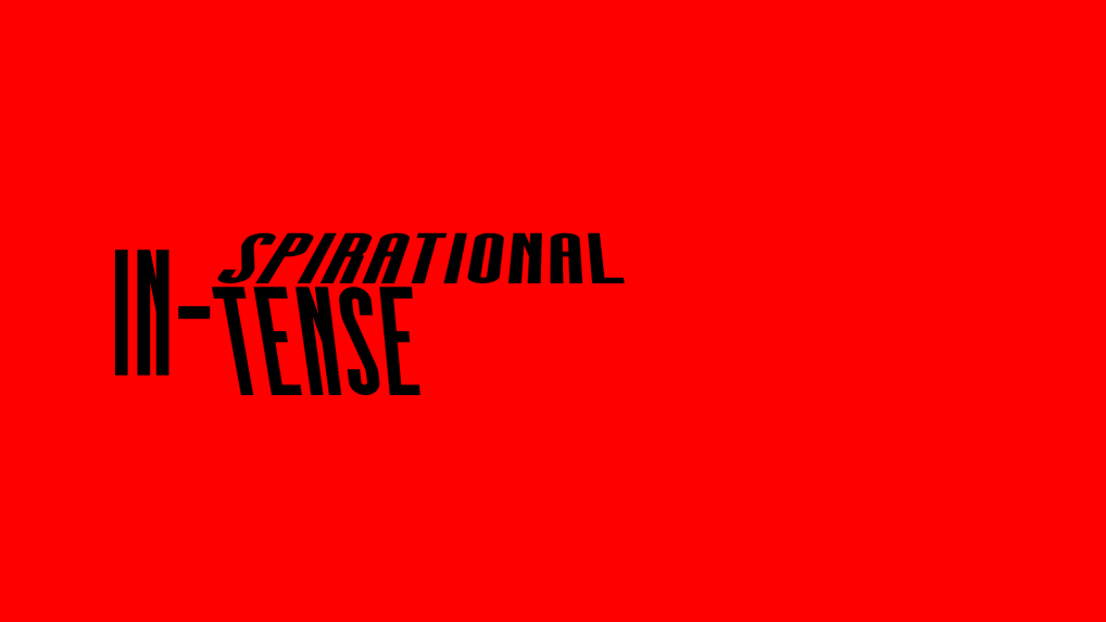
Logo animation for In-Edit, a film festival that connects the worlds of documentary and music.
This concept of connection has been used to create the identity through the hyphen and the prefix in, included in the brand logo.
—— View project
Abstract music video of a personal instant in life.
The assignment was to make a video about a personal moment of change. In my case, I went from monotony (represented by a metronome) to surprise and revelation and when entering the world of design (music).
I hereby declare that I do not own the rights to this song. All rights belong to the owner. No Copyright Infringement Intended.
—— View project
CD cover for a disco/funk single about meeting a girl in a disco.
The retro aesthetic resembles the one from the 70s and 80s album covers: the psychedelic balloon typography, the saturated colors, the model pose, etc.
—— View project
Logo animation for CBS, an American commercial broadcast television and radio network.
The company is sometimes referred to as the Eye Network, in reference to the company's trademark symbol which has been in use since 1951.
—— View project
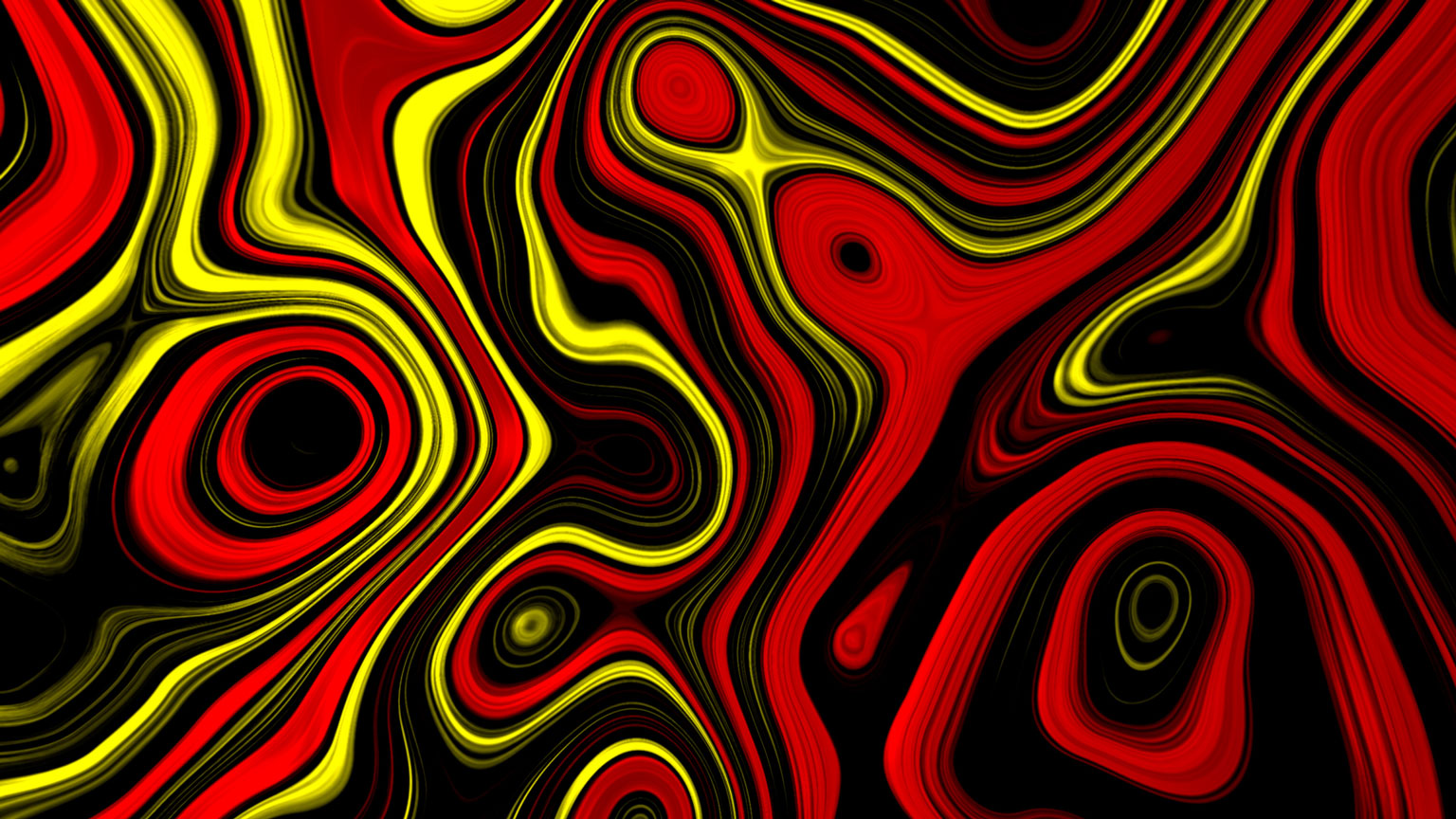
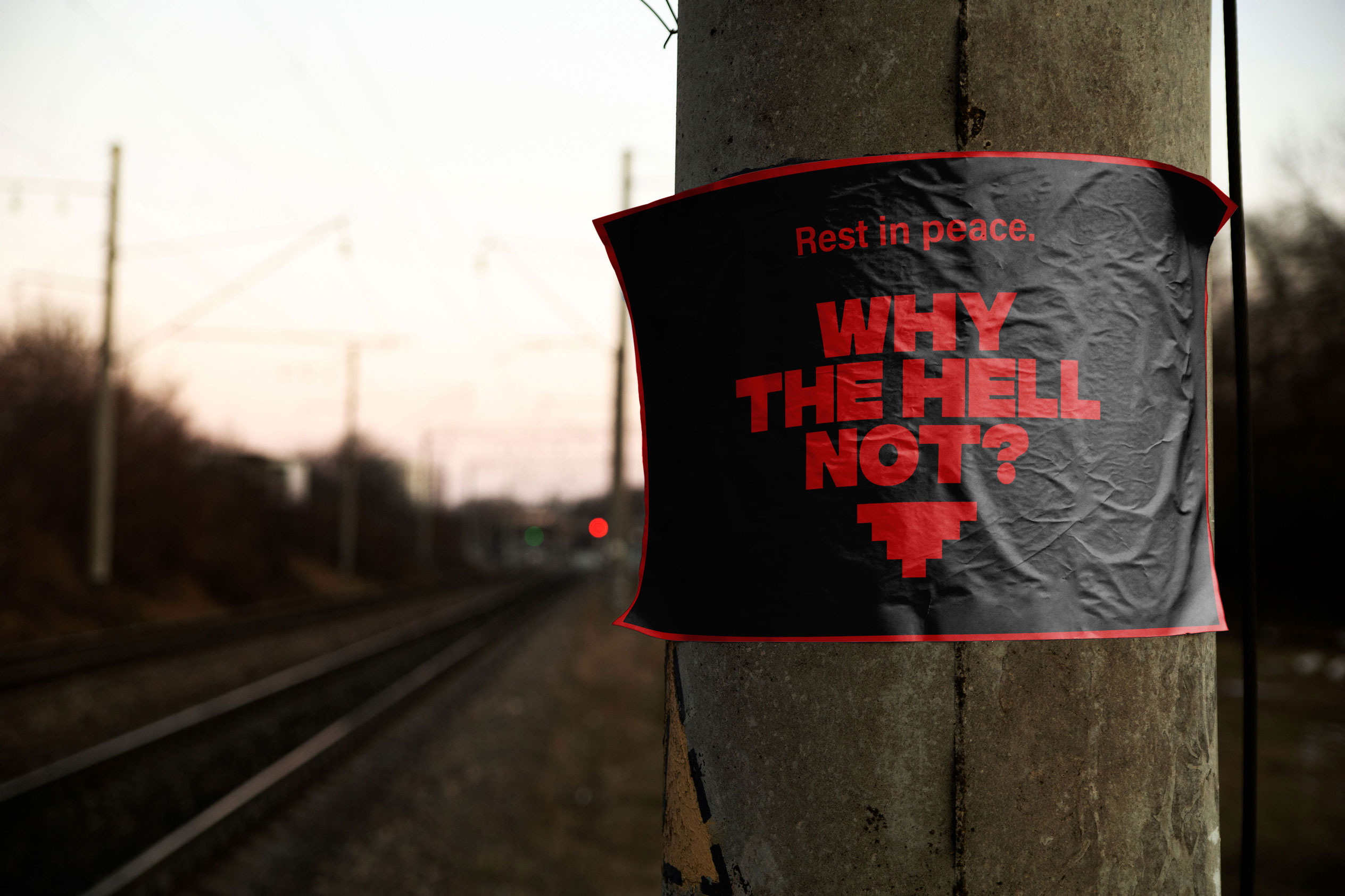
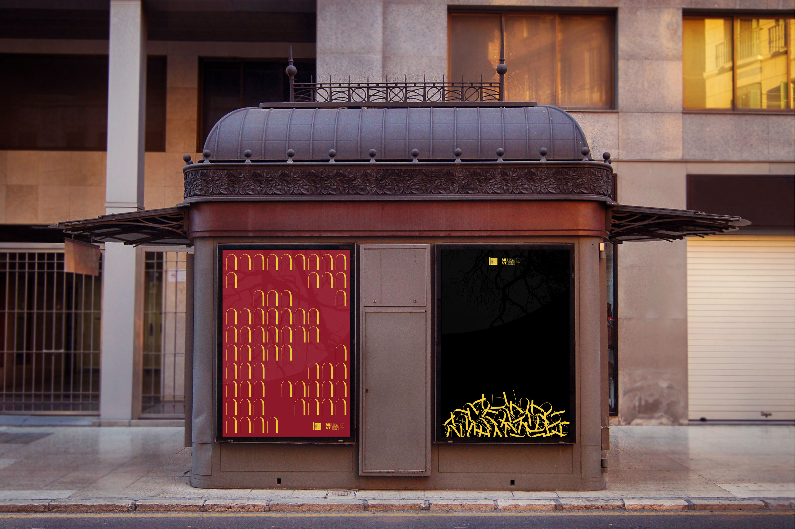
Clandestine advertising campaign for hell. In other words, a project with the aim of encouraging the greatest number of people to commit sins so that, when they die, their souls go to the underworld.
It is the result of taking the key concepts of hell, such as darkness and blood, and turning them into something tempting and readable (advertising). For that, I chose a minimalistic, modern, almost gaming aesthetic, as this was supposed to be a worldwide campaign that could be passed around clandestinely, almost like an entertainment.
The seven deadly sins were the main focus. After all, they are the ones that will take you to hell and are the connection between the earthly world and hell. They were represented using color (in a black background), for its strong relation to emotions.
This is my Graphic Design Final Master.
—— View project
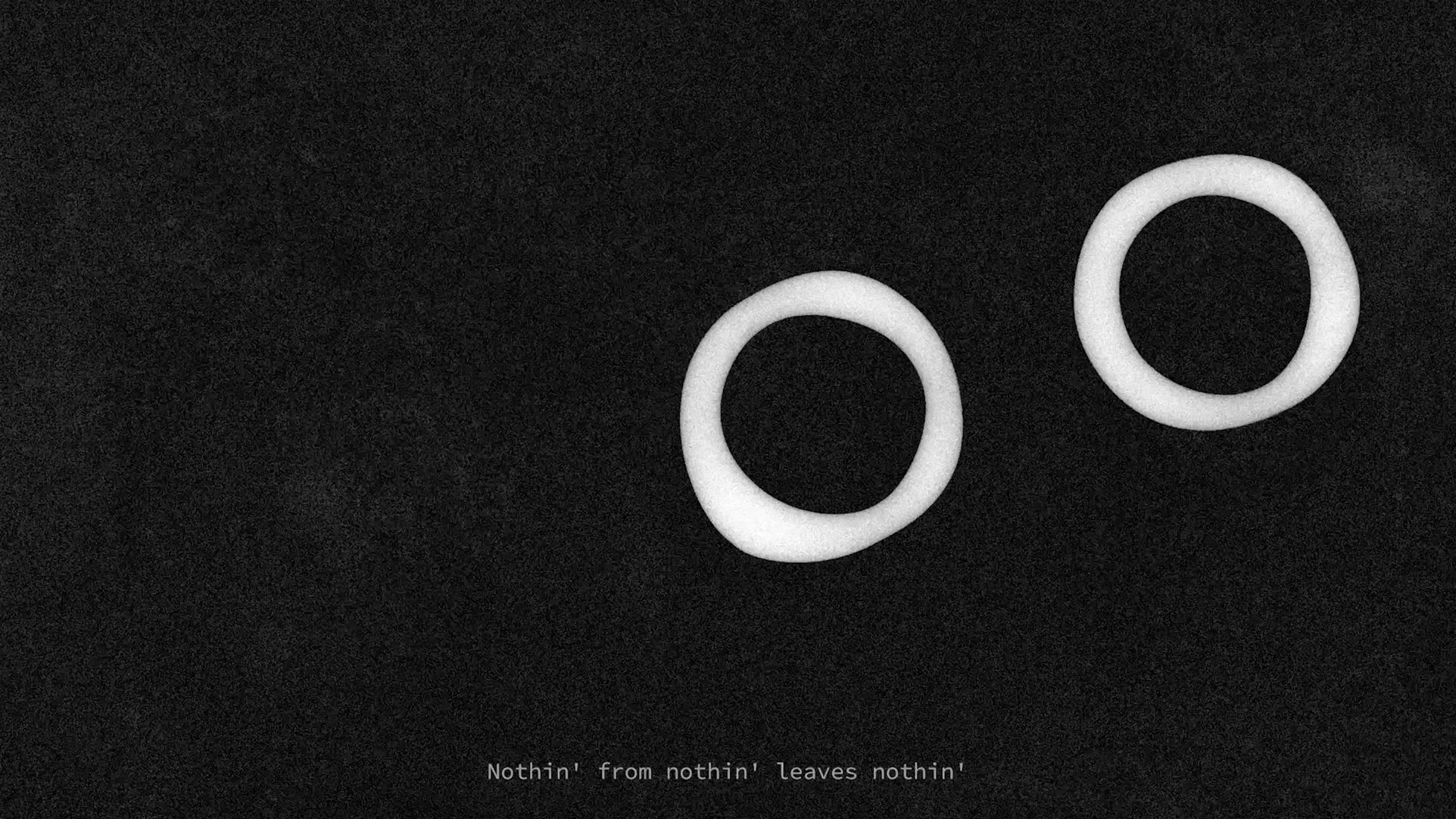
Music video of the song Nothin' from nothin' by Mac Miller.
I tried to vaguely represent the words while creating an environment of nothingness or emptiness. To do so I went for black and white and a lot of grain and background textures.
I hereby declare that I do not own the rights to this song. All rights belong to the owner. No Copyright Infringement Intended.
—— View project
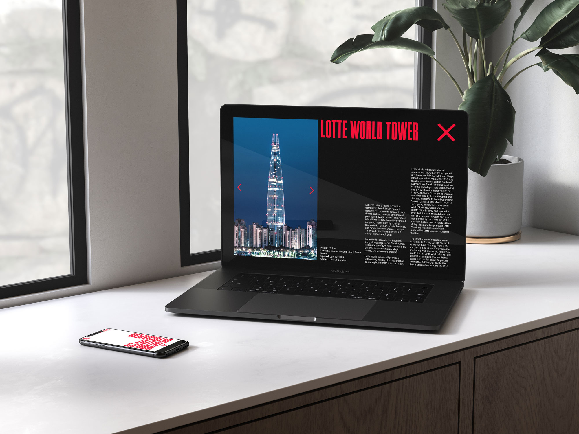
This website contains a ranking of the 10 tallest buildings in the world. The inspiration behind its design is building silhouettes for desktop and tablet and different floors for mobile.
The colors used in this minimalistic design are white (sky), red (buildings) and black (floor). The titles typography is very geometric and tall and its characters resemble Manhattan's squares.
—— View project
This infographic compares the 10 highest-grossing and highest-rated films of the 21st century.
The chosen categories were: genre, average grade, average budget, average grossing and origin.
—— View project

This project tries to represent different concepts related to the city of Venice through three different graphic approaches.
First, a coloured bottle that goes through its history: the golden past (richness, opulence), the red present (romanticism, passion) and the black future (which hides the collapse of the city).
Second, a photo album of a sinking Venice using a red duotone as if the city was bleeding.
Finally, two connected posters using only typography. One to praise the city (the disorder within the order) and the other one to critique it (the future collapse).
—— View project
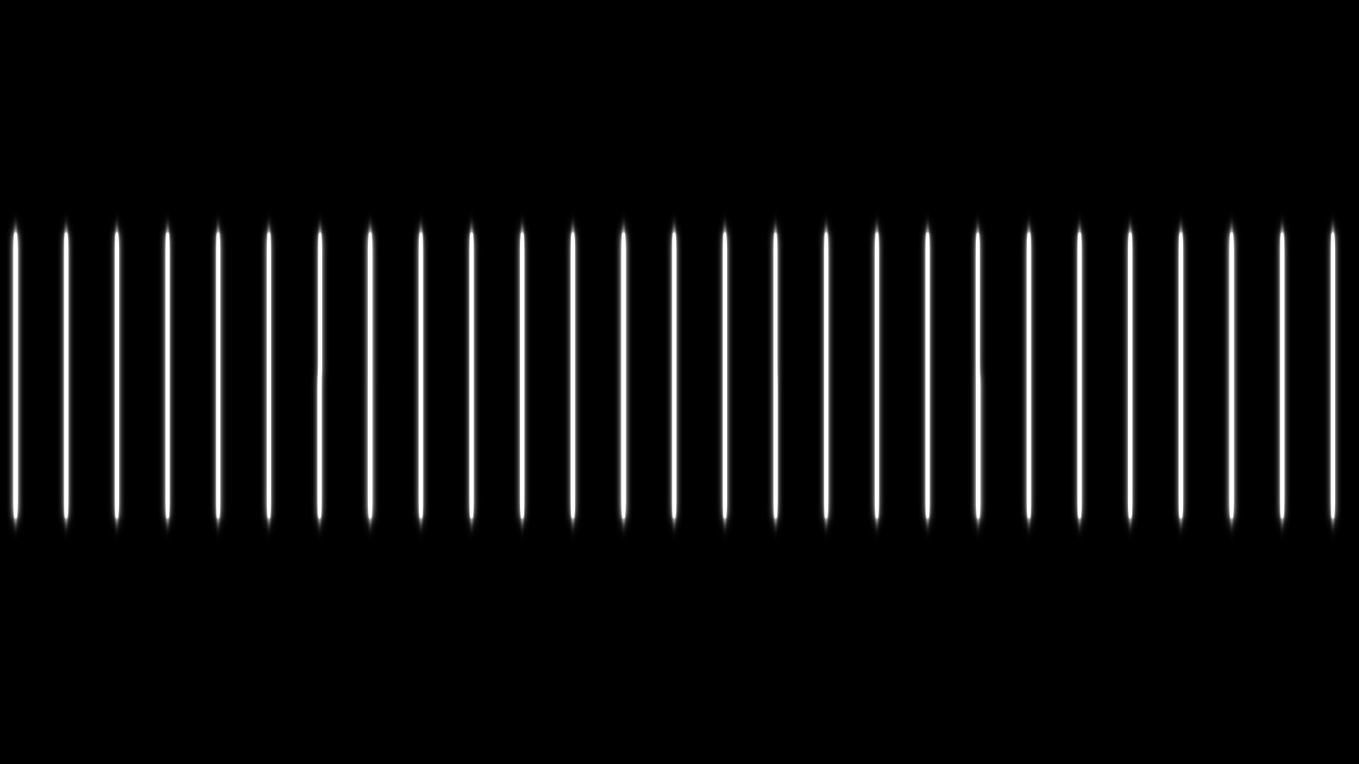
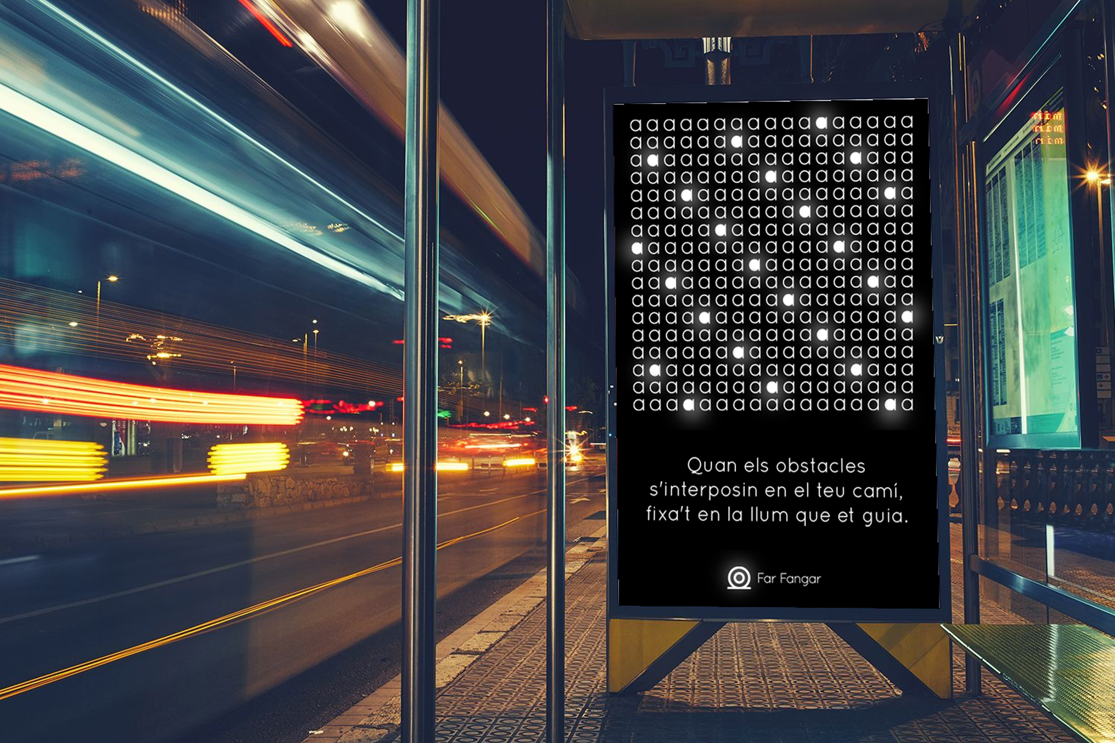
Due to its uniqueness and how it stands out in the arid environment, the Far Fangar is one of the architectural and landscape symbols of the Delta de l'Ebre.
This graphic identity is based on the light and repetition of its projection at intervals, every 12 seconds.
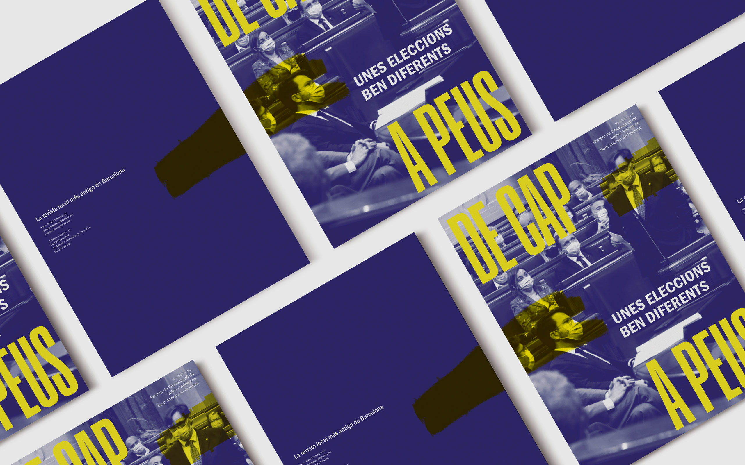
This project is a redesign of the existing Barcelona neighbourhood magazine "De Cap a Peus", reporting on what happens in Sant Andreu de Palomar since 1980.
The principal referents were newspapers, as it's an austere publication, condensed fonts, vertical layouts and duotones. In this case, I used the neighbourhood emblem colors.
—— View project
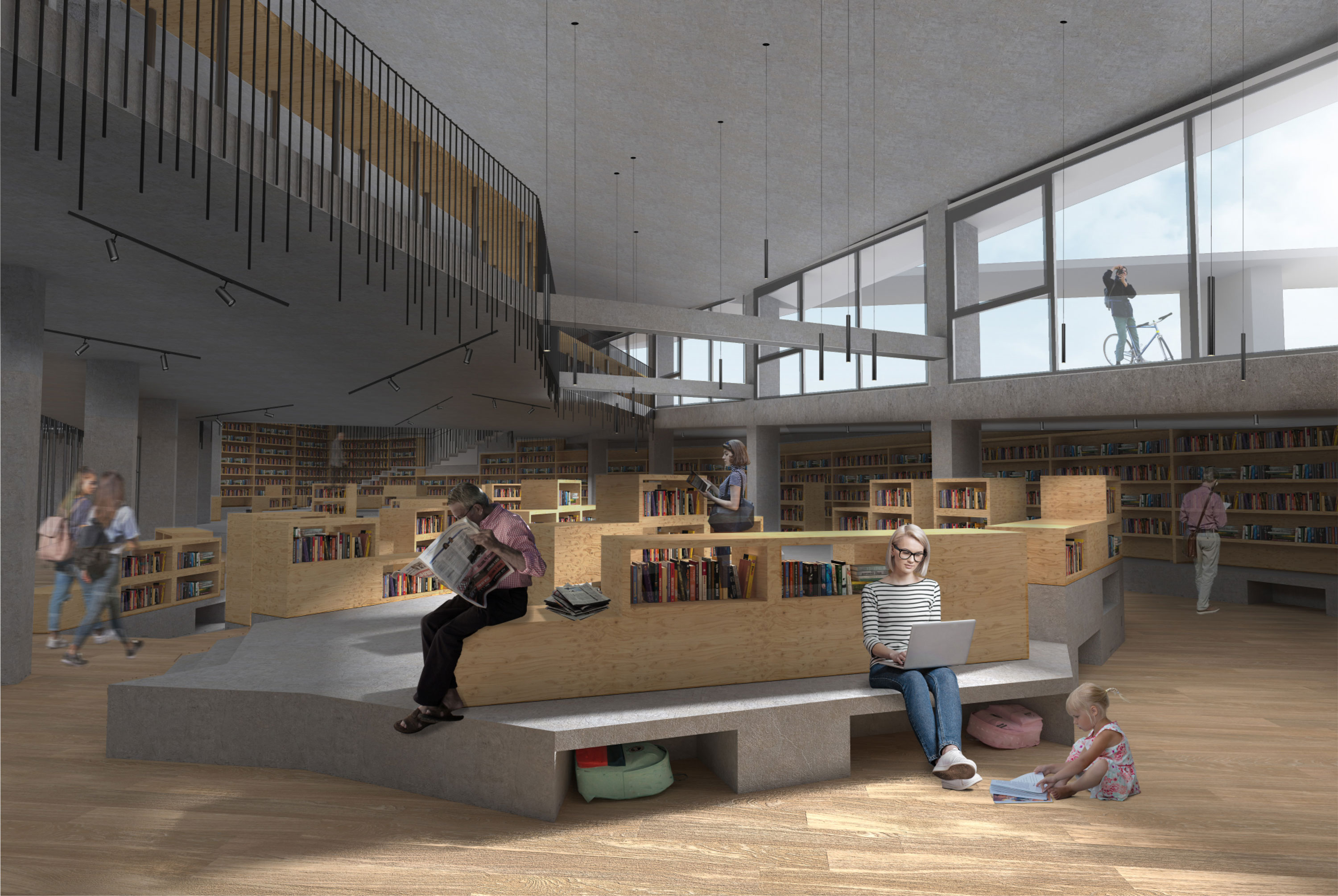
Urbanization project and new library and civic center in the park of Can Rigal, l'Hospitalet de Llobregat.
In this project I tried to give value to the abandoned farmhouse of Can Rigal through the connections and the environment. Because of that, the new building, completely different from Can Rigal and based on the concept of a cave, is half buried. This way it enables vision to the farmhouse from the street below and improves connections between levels.
Apart from that and following the urban plan, I projected the extension of the Can Rigal Park, already considered on the urban plan.
This is my Architecture Final Degree Project.
—— View project
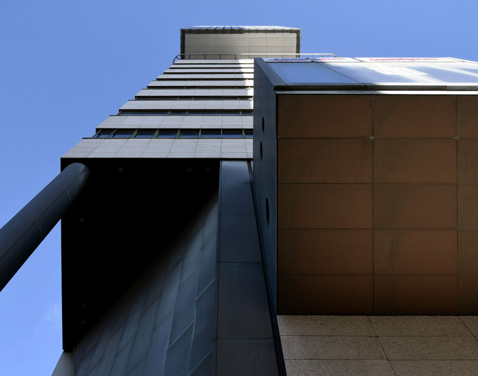
Photographic series of the building located on Passeig del Taulat 266-270, Barcelona, headquarters of the Citizen Attention Office of the Catalonia Government.
—— View project
Some tests without brief I've made to showcase and to search for new creative techniques.